
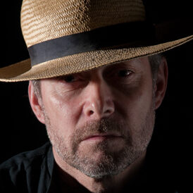
Leigh Preston in 1982 – The Southampton International Exhibition. I’m gazing at dozens of superbly crafted prints with a sense of awe, work by Tim Rudman, Bill Wisden, Bill Carden, Chris Peet, Roy King, Bob Moore, Tony Worobeic, Colin Westgate, Joan Waklelin and Vic Attfield, and plenty of others.
My own work around that time was mainly colour transparency, although I had learned the basics of Monochrome printing in my 6th form in 1969. In the mid-eighties I had very limited access to a proper darkroom, so Colour Slides were still my only output and, in 1985, I’d just failed a Fellowship using them.
Photographers, who I looked up to in my own club – John Philpott and Bob Elliott, were both excellent printers and both agreed – ‘Leigh, learn to print well, it’s all very well having a good eye for a picture, but the real craftsmen in this game make prints’. So, with my Father’s help, I built a darkroom in my loft. Hours, days, weeks, I spent in that dim red glow, enjoying the fumes, making mistakes, getting excited by the better results as Bill Wisden noted, “the best printers have the biggest waste bins!”.
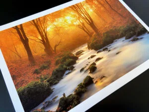
I still have a darkroom, very underused now but Darkroom printing has given me a certain tonal insight for Monochrome Digital work. Making those A3 exhibition type prints means dealing with colour hues or working with tones, adding or subtracting to change their density. Contrast and its control are vital. It’s possible, with care, skill and buckets full of patience, to strive for and make prints that show resonance in rich velvet blacks, or subtle diaphanous whites. At the other end of the spectrum printing allows the production of pictures with a tapestry of vibrant colours or their polar opposite in gentle pastels and subtle hi-key shades. All is possible at the printing stage and it’s high on satisfaction, a feeling of achievement and pride.
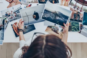
Finally, making the choice of paper surface is vital. It gives feel, texture and artistic merit, important when building panels, portfolio’s or illustrative projects. Learning is more by trial and error, sometimes by learning new methods, new approaches or adopting a specific genre that requires something distinctive and individual. I’ve illustrated the whole point of making prints with before and after examples.
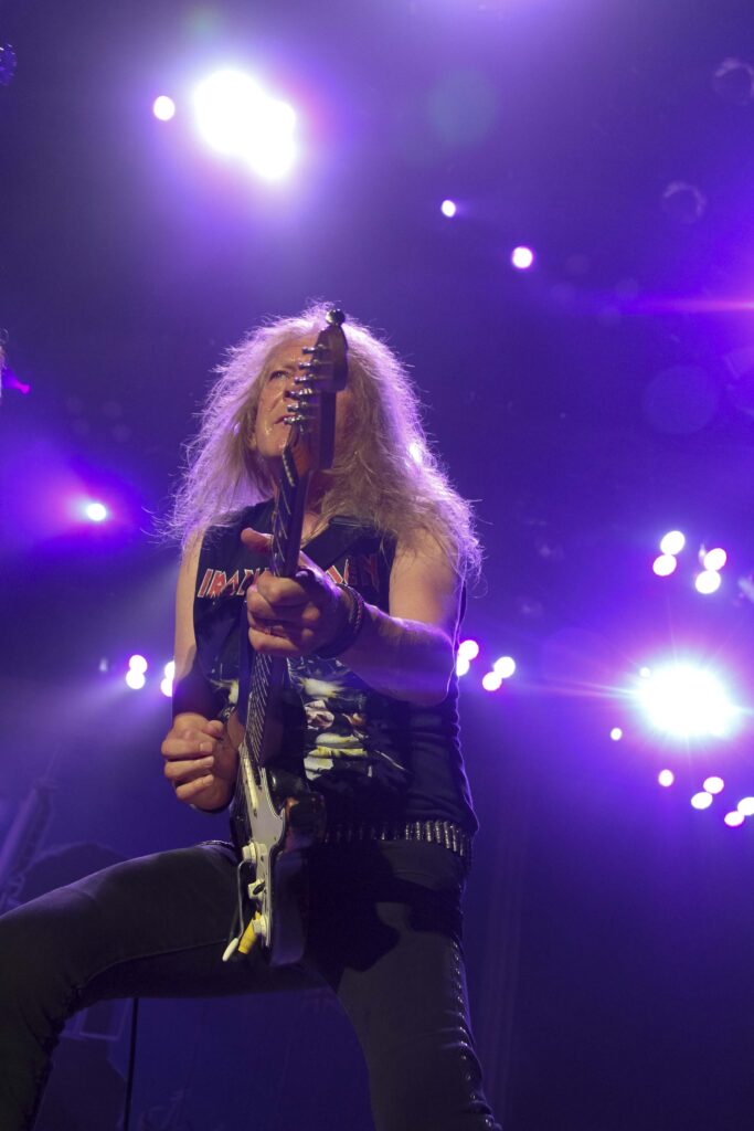
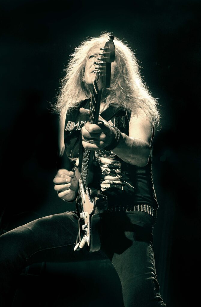
Janick Gers, guitarist with Iron Maiden.
“Not subtle, but then neither is the music they play. Cropped to isolate the guitarist, dealing with awful lighting and contrast. Split-toned in Blue and Gold.”
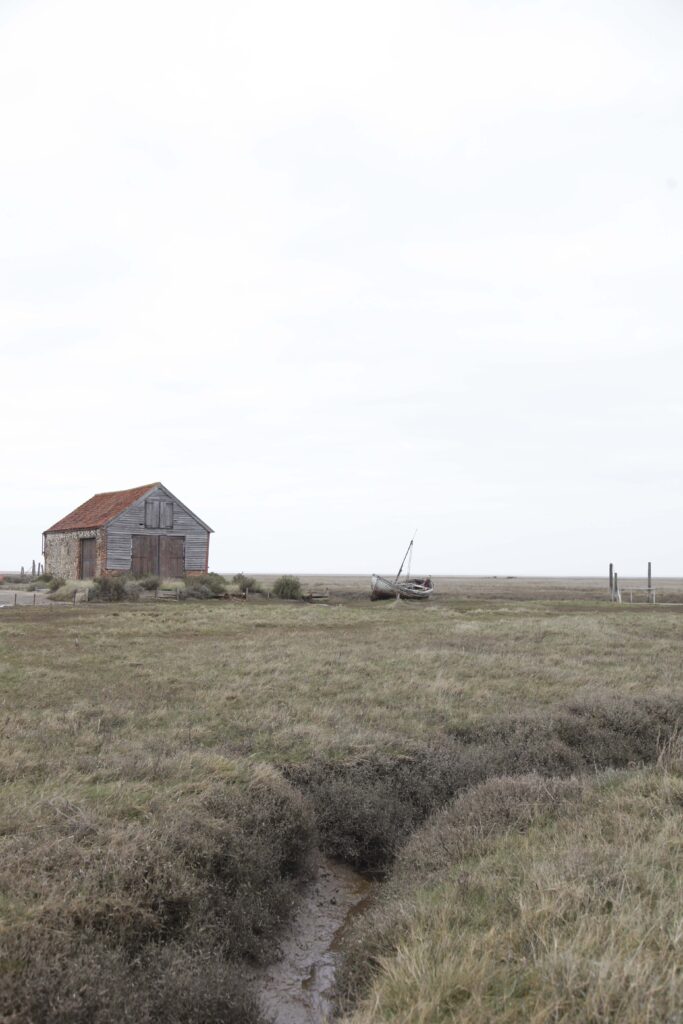
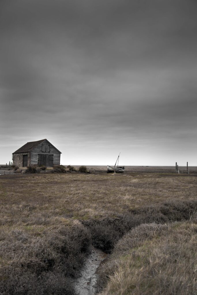
Norfolk Marshes
“Printed to show a sense of isolation and abandonment, making the sky far heavier , that shows the distance and openness of this landscape.”
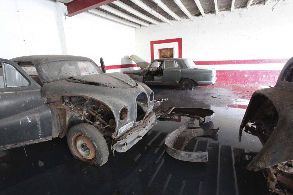
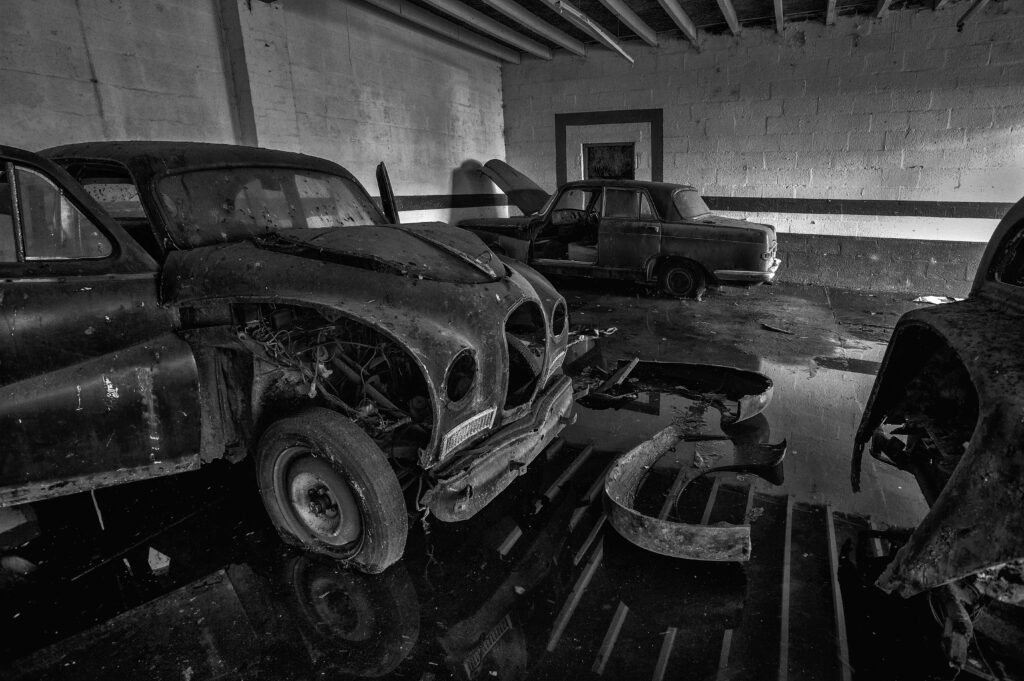
Abandoned garage in Silloth.
“Printed with added ‘clout’ for a dense ‘3D’ monochrome look, with a lot of local control of both contrast and tones.”
Taking the raw material, rough-hewn, straight out of camera and working with it to bring it to life, in the same way an artist starts with a blank canvas and a series of preliminary sketches. Printing is simply a way of interpreting what you took with your camera, but important as a means of personal expression. Recapturing what you felt when you pressed the shutter. A voyage of discovery in the art of the possible.
A refined mounted photograph that shows an individual ‘style’, one that carries your personality and a sense of emotion, is to my mind the finished article. It can become a visual conversation, appreciated by the more discerning viewer. It’s like a properly produced piece of music, something with depth, with harmony that stands up to repeated playing.
That print is yours. You saw the potential in the act of taking and, with careful use of software and by not accepting second best from yourself, that print is the successful fulfilment of your vision. Not everyone will agree with your interpretations, printing is reliably and beautifully subjective.
My own way of working is still relatively straightforward, rather mournfully archaic, a very ‘stripped down’ approach. At times naive. It has limitations, but perseverance and consistency have helped me to create a personal ‘signature’ within it. I’m not as drawn to clinical perfection as I should be, although motivation comes from chasing an atmosphere, and unvarnished authenticity, perhaps nostalgia. The finished pictures are often edgy, they lack digital ‘polish’, that’s how I see the often brusque and abrasive environments I work in. First and foremost they underline a memory. I heard it once said that my pictures look like the sound of a Neil Young guitar solo, raw, un-finished, harsh even. I felt rather pleased that someone would see them that way, because that’s exactly how I try to make them look.