
When I give print talks to camera clubs, I like to show prints printed on a range of different PermaJet papers. I do not use the complete range of their papers, instead limiting myself to nine or ten that I really like and have become familiar with. These are FB Gold Silk 315, FB Distinction 320, Portrait White 285, Titanium Gloss 300, Photo Art Silk 290, Museum Heritage 310, Matt Plus 240, FB Matt 285, Photo Lustre 310, and my all-time favourite – Oyster 271.
When it comes to questions at the end of each talk, I am often confronted with, “It’s okay for you using all these different papers – you probably get great discount from PermaJet for advertising them.” This is followed by the question, “If you had to restrict yourself to using one paper – what would it be?” Fortunately, this is an easy question to answer. It would be PermaJet Oyster 271 every time! I then tell them that the large majority of all the prints they have seen that evening are printed on Oyster.
I also tell the club members that Oyster is one of the most economically priced papers in the PermaJet range, which is a bonus.
So why do I like Oyster so much? Oyster is my ‘go to’ paper for 75% of my work, which is natural history, sport, landscape, and portraits. When photographing such a varied range of subject matter, it’s important to have a paper that will yield excellent results in all genres. If I were restricted to using only one paper, I would happily print everything on Oyster.
So why don’t I use it for everything? There are times when certain subjects look better on different papers. A soft pastel type of image will look okay on Oyster but is often more suited to a textured art paper. Likewise, a warm toned monochrome may be acceptable on Oyster but may look better on FB Gold Silk. It’s really a case of ‘horses for courses’.
Fortunately, Oyster is a complete ‘all-rounder’. Skin tones on portraits show amazing detail, nature images seem to jump off the paper at you, landscapes can look out of this world and show amazing tones and colours. It’s also great for monochromes, yielding brilliantly juicy blacks and whites with the full range of detail. When asked at talks which paper I used for monochrome I sometimes have to look very closely to see if it is on a Fibre Based paper or on Oyster.
If I had to pick a nickname for Oyster it would be ‘Jack’, because for me, it really is a ‘Jack of All Trades’!
Why did I use Oyster 271 for these images?
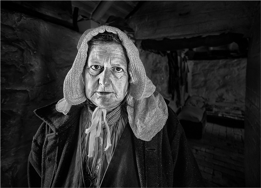
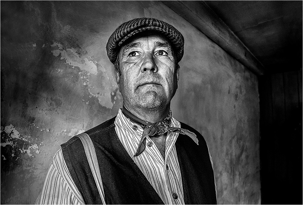
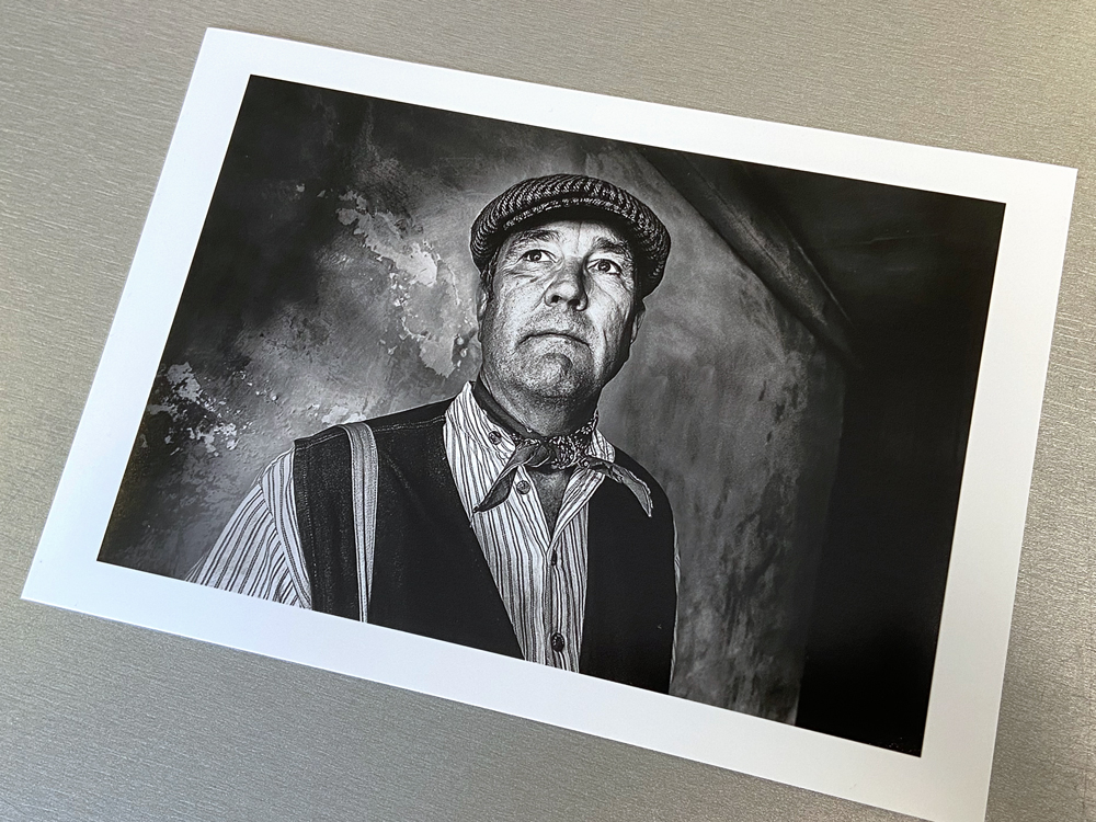
Black Country Museum Portrait
This was a shot I took a few years ago in the Black Country Museum, Dudley. Although shot in colour, I felt it was an image that was ideally suited for a conversion to monochrome. The reason I chose Oyster for this image was because it does produce prints with beautiful blacks and brilliant whites. You also get a full range of tones throughout the print, and result are very comparable to the results you get with Fibre Based papers. It produces black and white prints which are very similar to the result that I used to get when producing prints in a Darkroom.
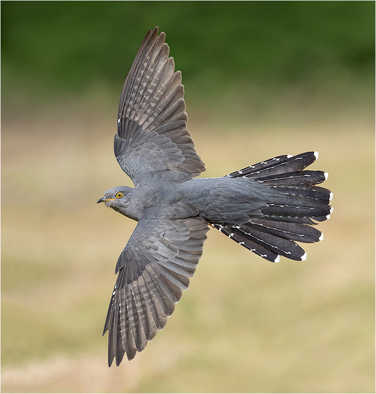
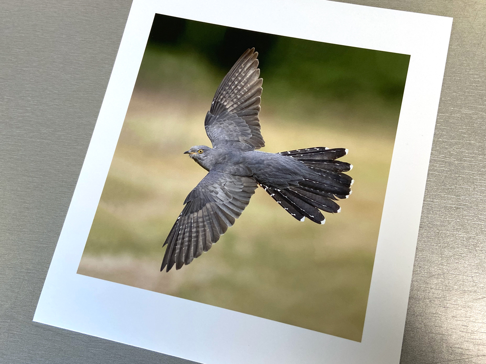
Cuckoo in Flight
This was a shot taken at Thursley Common in Surrey. I print virtually all my natural history images on Oyster because it produces quality prints that seem to ‘jump off the paper’. The surface of the paper really suits this image although it works well for all types of natural history subjects – butterflies, dragonflies, fungi, wild flowers, mammals… they all look brilliant when printed on Oyster.
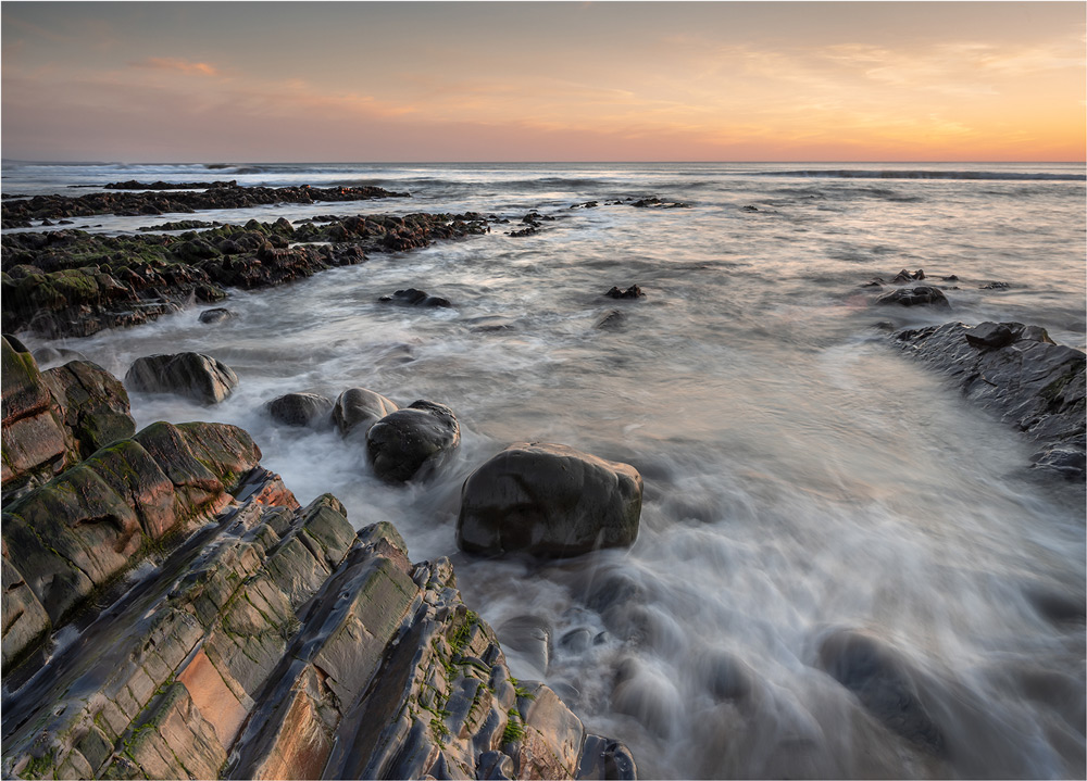
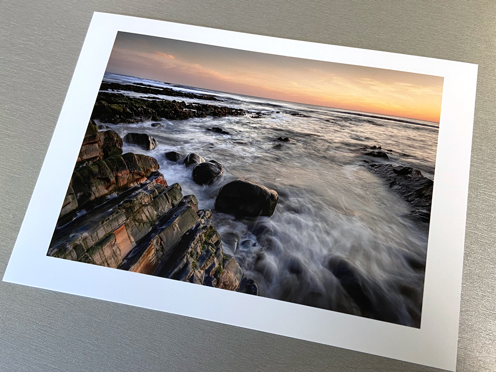
Sandymouth Bay Sunset
For landscape prints, Oyster fulfils all my needs. The range of tones and colours it produces are amazing, and it is my ‘go to’ paper for virtually all my landscapes, even the more arty images. Sunsets look particularly spectacular on Oyster. The range of tones and colours are always accurate portrayed, and when holding the print as it first comes off the printer, it gives the feeling that the image has been printed on a quality paper.