
Metallic papers have been around a while, with the pearlescent effect going back to darkroom days. Whilst I’ve never tried such papers in the past, I have seen quite a few papers with the word ‘metallic’ in their name.
I’ve even tried a few and whilst they were different, they all had slight colour tint to the surface reflection, which rather limited them for my own use. I’ve long regarded them as special effect papers, which, if I was being uncharitable, I’d suggest were good for distracting viewers from a less than optimal photo…
As a commercial and architectural photographer I want prints that intensify the impact of often quite technical subjects. I want the subject to be what grabs attention and not the paper. I also want good colour reproduction and a paper that’s robust when handed round a group of people. The Titanium Gloss is a good weight at 300gsm and with only modest amounts of brighteners (OBAs) gives a good white without an overly bluish tint.
I’ve tried the paper on an Epson P5000 (17″) printer. This has Ultrachrome HDX pigment inks, the same as the larger P7000 (24″) and P9000 (44″) models. The paper’s available on up to 60″ rolls making this a good option for my prints used for display work (trade shows, offices and the like – I don’t photograph weddings/people).
Profiling
First up I’ll need a custom profile. I use i1Profiler, with this i1Isis scanning spectrophotometer, making reading nearly 3000 patches on this target, very easy. I note that PermaJet offer a free profiling service if you buy the paper.
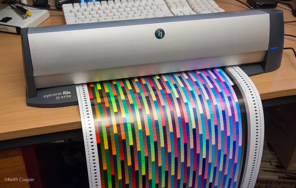
I’ve included the picture here since it gives a nice feel for the surface sheen of the paper. These coloured targets are often one of my very first prints with a new paper (or printer). The range of colours lets me see how the paper looks, without the distraction of an image. The paper is printed just as you would any other good photo paper.
I get to try a lot of papers and test new printers, so a degree of consistency is needed. That comes from always starting with known good test images. Never start by printing one of your own photos – first up, you don’t know if the colours are right, and in many ways more importantly, you have an emotional attachment to the image. If you can’t get a good print of a known test image, then what hope for an image you’ve edited yourself?
Black and White too
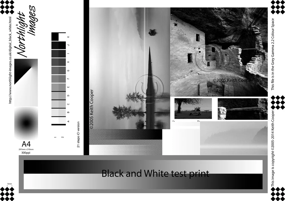
Black and white printing has been an interest of mine for many years, and it’s improved with new printers and ink sets more noticeably than colour, in the last 20 years or so. As part of my work I created a special B&W test image. It’s free to use non-commercially and is a tough test for any B&W photo printing setup. Once again if the test print isn’t spot on, then there’s no chance for my photos.
If it’s available I’ll try the printer driver’s black and white print mode to print this. For the P5000 it’s Epson’s ABW mode. You don’t have to use a specialist print mode though. It’s just that in general, these print modes are fine tuned for optimal print quality. You tend to get a more consistently neutral output than using a profile (even one optimised for B&W such as from the i1Studio).
When I’m testing a paper I do generate a lot of assorted measurement data, yet it’s something I rarely include in any reviews. Why?
Well I’m convinced that once you know a printer/paper is reproducing your test images without obvious faults, such as smudging, ink bleeding or blocked shadows, then the real question is to whether the look of the paper suits your personal preferences for how the image looks. There is also the more problematic aspect in that unless you know and understand the methodology and underlying meaning of all those numbers, they often contain very little useful information.
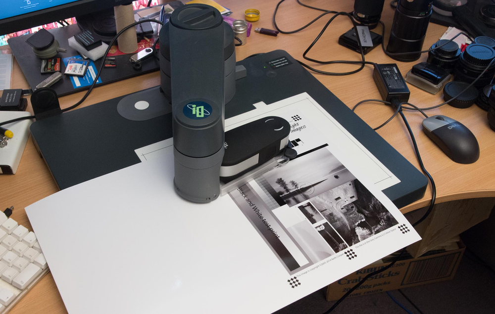
Here’s my i1iO spectrophotometer at work measuring the 21 step greyscale on the B&W test image.
The data’s not important here, what I’m looking for is the linearity of the B&W printing. I’m not interested in any Dmax numbers – I want to see that my prints won’t lose shadow detail or show blown out highlights. Remember, that for myself, it’s about what the print looks like, and for this paper in this printer, profiling shows no problems.
Some prints
Different papers suit different images (and personal tastes) and just looking at the profiling/test prints suggests that some of my product photos will work well.
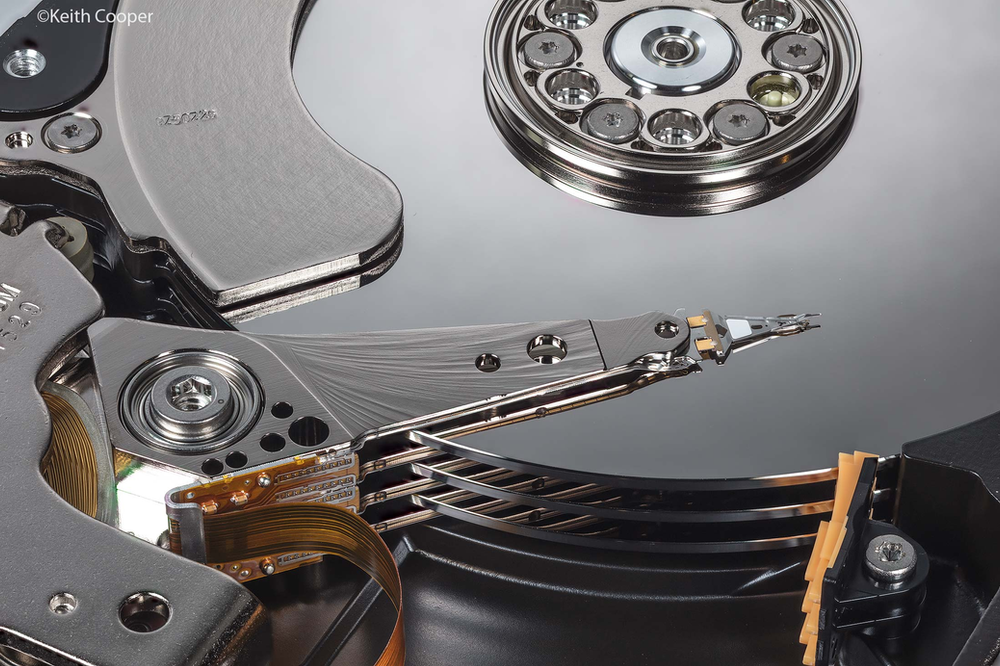
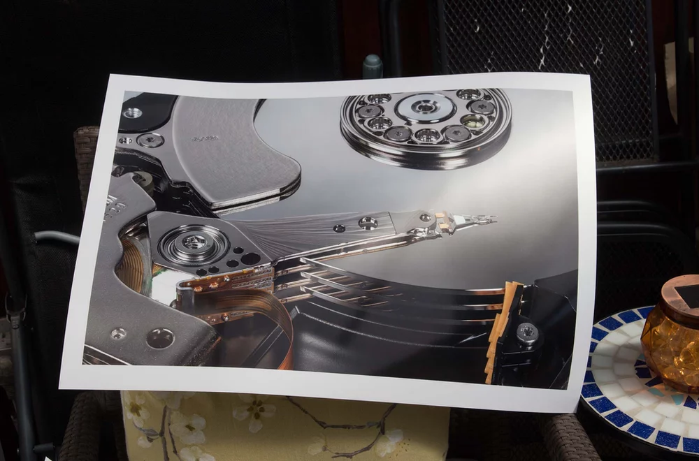
I’ll start with this photo of the read-write heads of a computer disk drive. It’s a 50MP stacked focus image taken with a Canon 5Ds on a motorised StackShot macro rail.
Here’s an A2 sized print, printed from Photoshop, using the custom profile I’d created. It’s taken with diffuse sunlight on the print, to give a bit of a feel for how the paper looks.
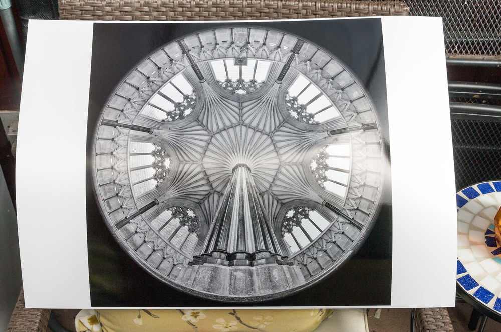
A black and white fisheye shot of the Chapter House at Wells cathedral gives a very crisp feel to detail.
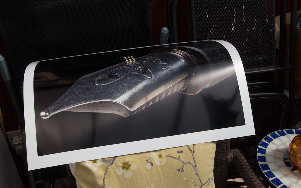
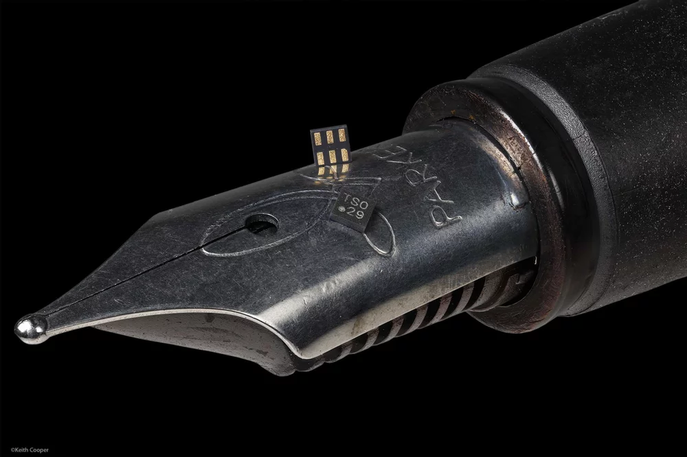
My own feeling is that the paper is at its best for shots with a bit of colour, such as this pen nib, with two very small integrated circuits. Once again it’s a stacked shot, and the print is outdoors to better show the surface texture.
Here’s the source image – lots of fine detail and texture from the stacked 50MP images. In case you were wondering, this is the sort of image the manufacturers of the chips would use at say 2m x 3m on a trade stand. The idea is to put the size of the chips into context against a known object. You also want something that will catch the eye of passers by and cause them to pause for a moment.
How does this paper ‘work’
The sheen is very difficult to show in static shots on the web, so I’ll finish off with these two shots from when I got out the USB microscope.
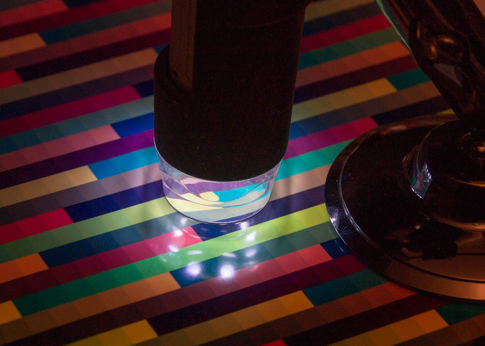
The magnification is about 400X. You can clearly see the ink droplets from the printer, but look in between them.
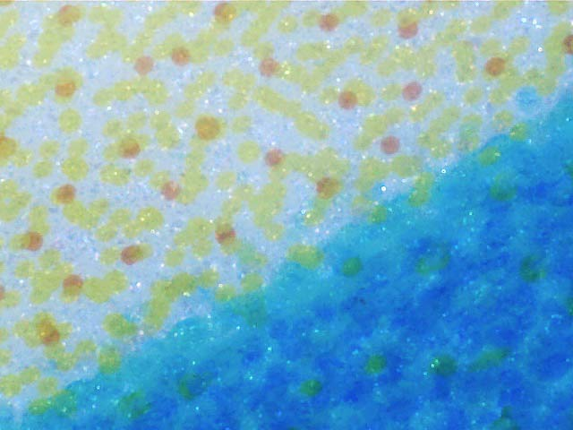
There are lots of tiny reflective crystals. These give a different reflection/angle profile to normal gloss or lustre paper surfaces. They also explain why lighter parts of the image show the metallic effect more clearly – there are more gaps between the ink dots.
Paper use
This is one of those papers that with the right sorts of image will make prints that really do leap out at you without seeming overly gimmicky. It also doesn’t have the pink glow I’ve seen before with some metallic papers – definitely one for some of my technical prints.
Keith’s full technical review:
http://www.northlight-images.co.uk/permajet-titanium-gloss-300-metallic/
Keith’s printer test images: