
Getting really good black and white prints from an inkjet printer can be tricky for many photographers. Inkjet printers typically mix colours with up to 12 different inks and the slightest imbalance means that you may see colour casts or tonal gradations that aren’t as smooth as you’d like. However, with good inks, excellent paper and accurate printer profiles you can get the quality and neutrality that you want. You just need to follow the simple tips and techniques outlined below. I’ll include ways you can customise your printer with specialist inks or software towards the end of the article but for most of it I’ll assume you are just trying to get great mono prints from a standard inkjet photo printer.
COLOUR MANAGEMENT STILL MATTERS!
I’ve met some photographers who claim that colour management doesn’t matter for black and white printing. They are wrong. If anything it is more important than it is for colour printing. It seems counter intuitive I know but the fact is that the human visual system can easily pick up very small colour casts in near neutral colours that would be hidden in a full colour image, so the smallest error on the print can show up. Also the key to a black and white image is tonal detail so you need a very well calibrated monitor that shows you accurately every single tone in your shot. In fact if you are a black and white specialist I’d say you have to spend more than average on a monitor and get one with higher end hardware calibration features and higher bit look up tables to ensure you can see every highlight and every shadow.
Whichever monitor you have the calibration and profiling of it has to be done very well so that you see a neutral image on screen with a good tonal range. You’ll need to think about the ambient lighting as well. If you are going to see the shadow detail in your images then the room needs to be dim with the monitor being the brightest light source.
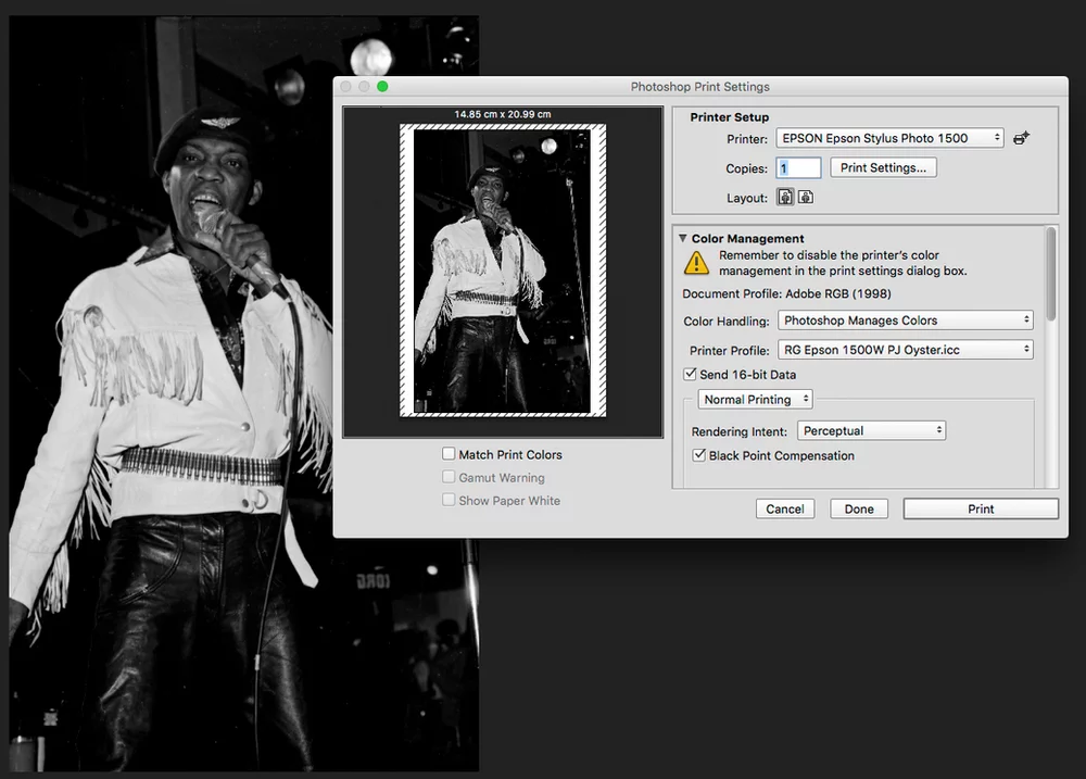
Accurate printer profiles are also vital. Generic profiles that you download from paper manufacturer’s websites probably won’t cut the mustard. If there is only the smallest difference between your printer and the one that was profiled you will see a colour cast on the print. You need a custom profile made for your actual printer, we offer a FREE Custom ICC Profiling Service on all PermaJet Papers. There are even profiling services offering specialist post profiling optimisation that often enhances grey balance and shadow detail. An accurate printer profile will deliver a good black and white print. It’s only when the profile is inaccurate due to changes in the printer, or sometimes poor profile creation, that you get colour casts in all or some of the tonal range.
One surprising factor that still has an influence on the print is the rendering intent you use when you print. Generally they deal with converting colours but grey is still a colour and Perceptual or Relative Colorimetric rendering will produce very subtly different results which can be well worth experimenting with.
The left side of this image has been converted to a printer profile using Perceptual rendering, the right side with Relative. Even with black and white images rendering intents can make subtle differences.
You’ll also need to be careful where you view your print. Artificial light sources such as energy saving light bulbs can introduce a colour cast to inkjet prints so make sure you only view the prints in good daylight.
RGB OR GREYSCALE?
Photoshop allows you to work with monochromatic images either as greyscale files that only contain black information or as neutral RGB images that make up the greys from equal values of RGB. Generally working with an RGB file gives you more flexibility. You can add the black and white conversion as an adjustment layer. This means that you can go back and tweak the original colour image or adjust the mix of RGB colours in the conversion to get the effect of traditional red, orange or yellow filters. Whichever way you go your printer profile will treat neutral input the same.
This left third of this image has been edited using Photoshop’s Color Balance tool with just a -2 red adjustment. The right third with +2 red. The centre third is unedited. You should be able to see the subtle differences between each third. The human eye is very good at seeing difference in greys.
PAPER CHOICE
One of the most important factors on how your print will look is the paper you print on. This is as true with inkjet as it was in the darkroom. Glossy papers [insert examples] will have a wider tonal range producing deeper blacks. Matte papers [insert examples] tend to make prints with less contrast. You need to match the paper with the subject. Likewise paper colour is very important. An inkjet print’s grey balance starts from the paper colour and goes to the darkest black. So a bluer paper (such as a glossy photo paper) will produce a colder print. A warm baryta stock will produce warmer tones. There is no true absolute neutral, and there never was in the dark room either. If you look at an Ansel Adams print you will see subtle shifts in colour caused by the paper, ageing and the development process. Again, choose your paper base colour to suit what you want to achieve with the print.
A good custom ICC profile for your own printer will maximise highlight and shadow detail and minimise colour casts.
You will find that different papers retain different levels of shadow detail, and all will generally show less than you can see on a good monitor. Using soft-proofing will help, but one technique you can use is to output a step wedge of near black tones and then see where you stop being a difference. You can then use a Levels adjustment layer to set the output black point to the visible range.
INKS
Obviously the ink in your printer is also very important. There is more chemistry in the inks than many people think and very cheap inks simply aren’t as good as the original manufacturer’s or quality third party brands. Inkjet printers that have two or three different black inks generally give better results than those with only one black. This is because when printing neutral images mostly only black inks are used so this minimises the risk of colour casts caused by printer changes or lighting. If a printer has only one black ink then cyan, magenta and yellow will be being used to make grey tones as well.
TAKING THINGS FURTHER
Some printers with multiple black inks have specialist advanced black and white printing modes that only or mostly use just the black inks. These modes can produce very good prints. Also you can buy specialist replacement insets that contain multiple black inks, or specialist software such as the Quadtone RIP that manages black and white printing differently to the normal printer driver.
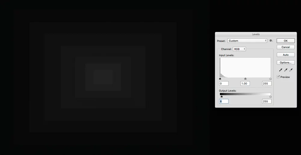
If you are losing detail in shadows a simple test can show you how much shadow detail your paper can retain. You can then use Levels to set the output levels so that all your detail prints. You’ll find that different papers retain detail (difference) at varying points.
IT IS POSSIBLE!
Good black and white prints are easily achievable, with a little planning and patience. If you are using our inks or papers and need help getting better black and white prints then get in touch and we’ll offer any advice we can.
#technical #blackand #advice #howto #RobGriffith #photography #printing #inkjet #PermaJet