


Paper is Part of the Artwork
When you reproduce your artwork, the paper isn’t just something to print on. It becomes part of the finished piece. The same file printed on a smooth bright white sheet and on a textured cotton rag will look and feel like two different artworks, and the buyer notices before they’ve taken in the image itself.
That’s why choosing the best paper for art prints is as much a creative decision as a technical one. A watercolour printed on a cheap, uncoated sheet loses the texture that made it a watercolour. A detailed pencil drawing on a heavy weave loses the fine lines that made it worth buying.
This guide covers what to look for in art paper, how to match it to the way you work, and the six PermaJet papers we’d pick for different styles of artwork.
Five Factors that Shape the Finished Print
WEIGHT
Weight is measured in GSM (grams per square metre), and it’s the first thing a buyer feels. A heavyweight sheet signals quality before they’ve looked closely at the image. Heavier papers also tend to carry better coatings or cotton fibres, which hold ink more evenly, and they resist creasing and warping, so they frame better. For art prints, 250gsm and above is a sensible starting point.
Surfaces run from gloss through smooth matt to heavily textured, and texture is your main tool for making a reproduction feel like the original. A watercolour benefits from a surface that echoes watercolour paper. An oil painting benefits from texture that brings out the brushwork. Pencil and digital work usually suits a smooth surface, so nothing competes with the fine detail.
WHITENESS
Printers have no white ink. The white in your print is the paper itself, so its tone matters more than most people expect, especially if your artwork has large white or neutral areas. Natural white papers give a softer, more traditional look that suits most fine art. Bright white papers make colours punchier, which can suit bold graphic work.
Many papers get their brightness from optical brightening agents, or OBAs. These break down over time, and the paper settles back to its natural tone. Kept away from strong UV light, the change is very slow, and for open edition prints it’s rarely worth worrying about. But for museum pieces, or limited editions where longevity is part of what you’re selling, an OBA-free paper is the safer choice.
Resin coated (RC) papers have a smooth, water-resistant surface with a wide colour range. They’re built for photographs rather than art.
Alpha cellulose is refined wood pulp with the impurities removed. It gives crisp colour and good archival stability at a lower price than cotton.
Cotton rag is the traditional fine art base. It has a soft, natural feel, excellent longevity, and a nuanced tonal range, at the cost of slightly less colour punch than a coated photo paper.
For a closer look at the difference, see our Photo Papers vs Fine Art Papers blog.
Acid-free means the paper has a neutral or slightly alkaline pH, so it won’t yellow and break down the way cheap poster paper does. As a result, it’s essential for anything you sell. Acid-free alone doesn’t make a print archival, though. Longevity also depends on using pigment ink and on how the print is displayed. Our Guide to Giclée Prints blog covers what makes a print genuinely archival.
Why Matt Paper is the Right Choice for most Art Prints
There’s no wrong answer here. It comes down to how you want the finished print to look. But for most art reproduction, we recommend a matt paper, for three reasons.
It echoes the original artworks surface
A matt surface, especially a textured one, is much closer to the watercolour sheets, canvas and drawing papers original artwork is made on. The print reads as an artwork rather than a photograph of one.
It doesn’t reflect
Art prints are made to hang on walls, often opposite windows or under lamps. A matt surface scatters light, so there’s no glare from any angle.
It handles tone gently
Matt papers give soft, smooth tonal transitions, which suits the blended washes and layered colour found in most painting and illustration.
The trade-off is punch. Matt papers can’t reach the deepest blacks or the most saturated colours a gloss or lustre paper can. For bold digital illustration or graphic work where vibrancy is the point, that matters. A paper with a subtle sheen, such as Photo Art Silk 290, is a good middle ground, giving more depth than matt without the glare of gloss. Our guide to matt paper goes into more detail.
Matching Paper to Your Art Style
The quickest way to narrow your choice is to start with how the original was made.
Watercolour and gouache
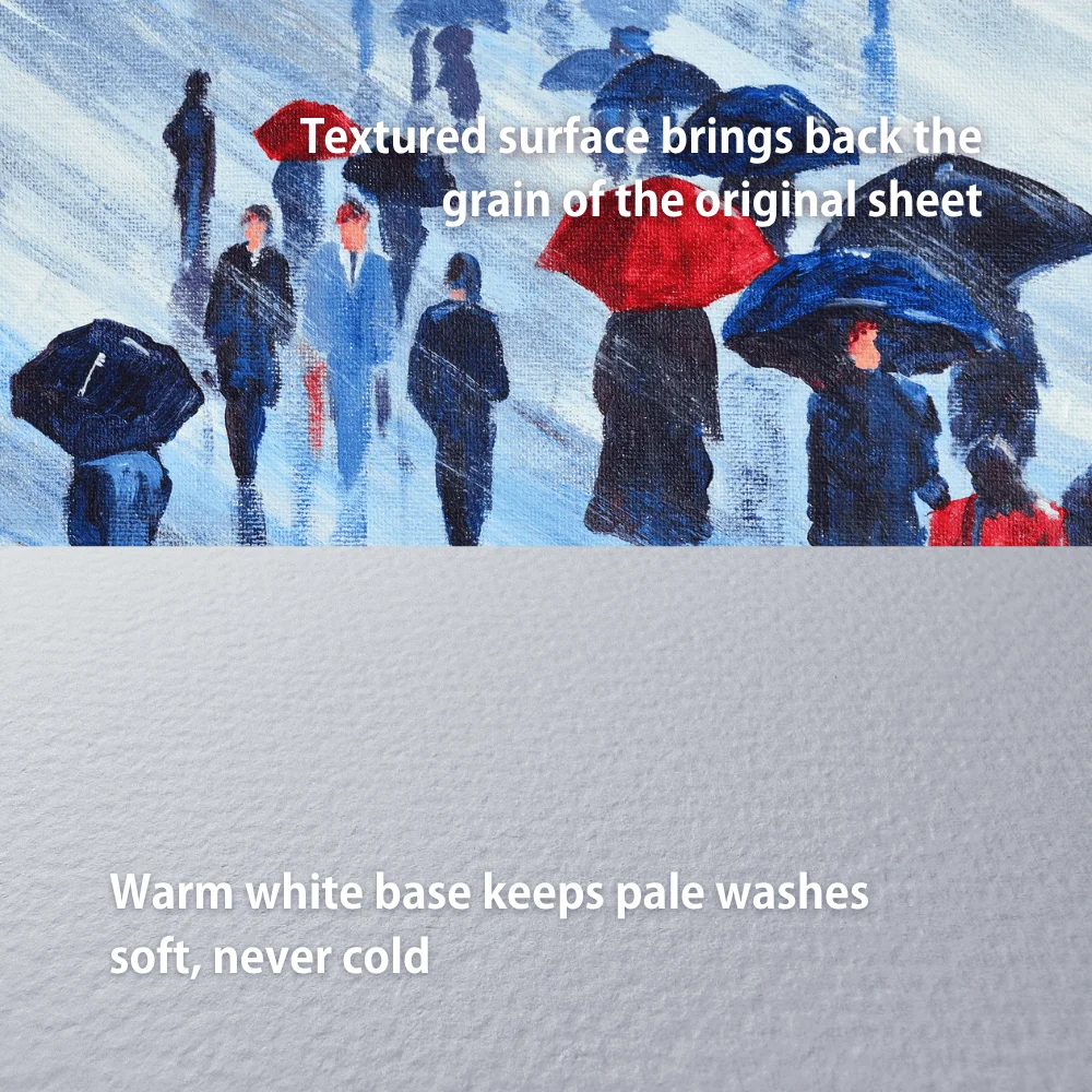
Pick a paper that echoes the surface you painted on. A cotton rag with a watercolour-style texture brings back the grain of the original sheet and gives washes the same soft edges. Warm, natural white tones suit watercolour better than bright white, which can make pale washes look cold.
Our pick: Watercolour Rag 310
Oil and acrylic
Here the texture of the paint is part of the piece. A naturally textured matt surface gives a sense of the brushwork and impasto, and a heavier weight gives the print the substance a painting deserves. If your palette is rich and you want a touch more vibrancy, a textured paper with a subtle sheen works well.
Our picks: Museum Heritage 310 or Photo Art Silk 290 for more richness
Pencil, charcoal and ink
Drawn work lives in its fine lines and delicate shading, and a heavy texture will break them up. For this reason, choose a smooth or very lightly textured cotton paper.
Our pick: Portrait Rag 305
Digital art and illustration
Digital work has no original surface to match, so the choice comes down to the look you want. A smooth, bright white matt paper keeps colours crisp and lines sharp, and it’s economical enough for larger print runs. For premium editions, a paper with more body and a slight sheen adds depth.
Our picks: Matt Plus 240 for everyday runs or Photo Art Silk 290 for premium editions
Subtle, soft or pastel work
Quiet palettes need a paper that won’t overpower them. A smooth cotton matt with a mid-white tone keeps gentle colours true, and a lighter weight suits smaller prints and cards.
Our pick: Portfolio Rag 220
The Best Paper for Art Prints: 6 PermaJet Options for Soft or Pastel work
The quickest way to narrow your choice is to start with how the original was made.
1. Matt Plus 240, for digital art and high-volume runs
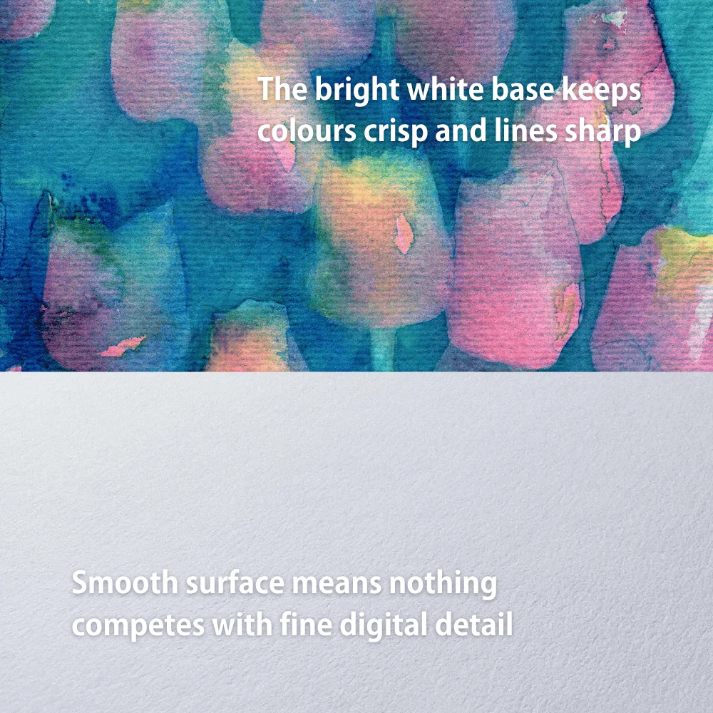
240gsm alpha cellulose, smooth matt, bright white. The bright base keeps colours crisp and lines sharp, which suits digital artwork and illustration. It’s also the most economical of the six, so it makes sense for open editions, markets and online shops where you’re printing in quantity.
Drawback: it’s the least luxurious in the hand, and the bright white base comes from OBAs, so it isn’t the choice for limited editions sold on longevity.
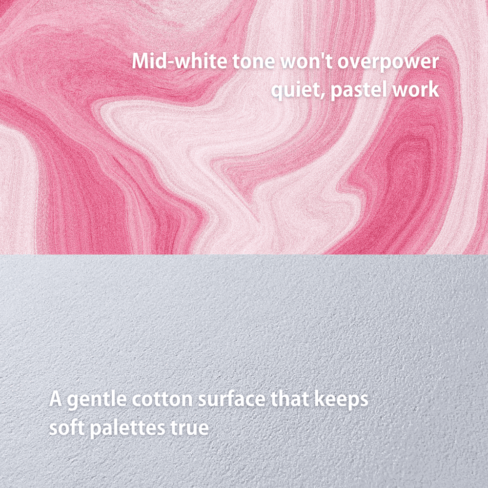
2. Portfolio Rag 220: Best Paper for Subtle Art Prints
220gsm, 100% cotton rag, smooth matt, mid-white. A gentle surface that keeps soft palettes and pastel tones true without overpowering them. The lighter weight suits smaller prints, cards and anything that needs to post easily.
Drawback: it’s the lightest paper here, so large prints won’t have the weight buyers expect from a premium piece, and the smooth surface adds no texture for painted work.
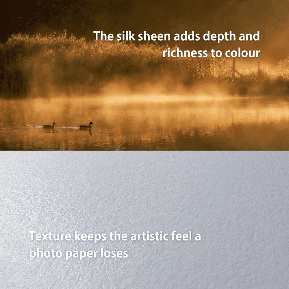
3. Photo Art Silk 290, for rich, dimensional artwork
290gsm alpha cellulose with a textured matt surface and a subtle silk sheen, mid-white. It sits between a fine art matt and a photo paper, giving colours more depth and richness while keeping an artistic texture. A good choice when you want a premium feel with extra punch.
Drawback: the sheen reflects some light, so it’s less forgiving under direct lighting than a true matt paper.
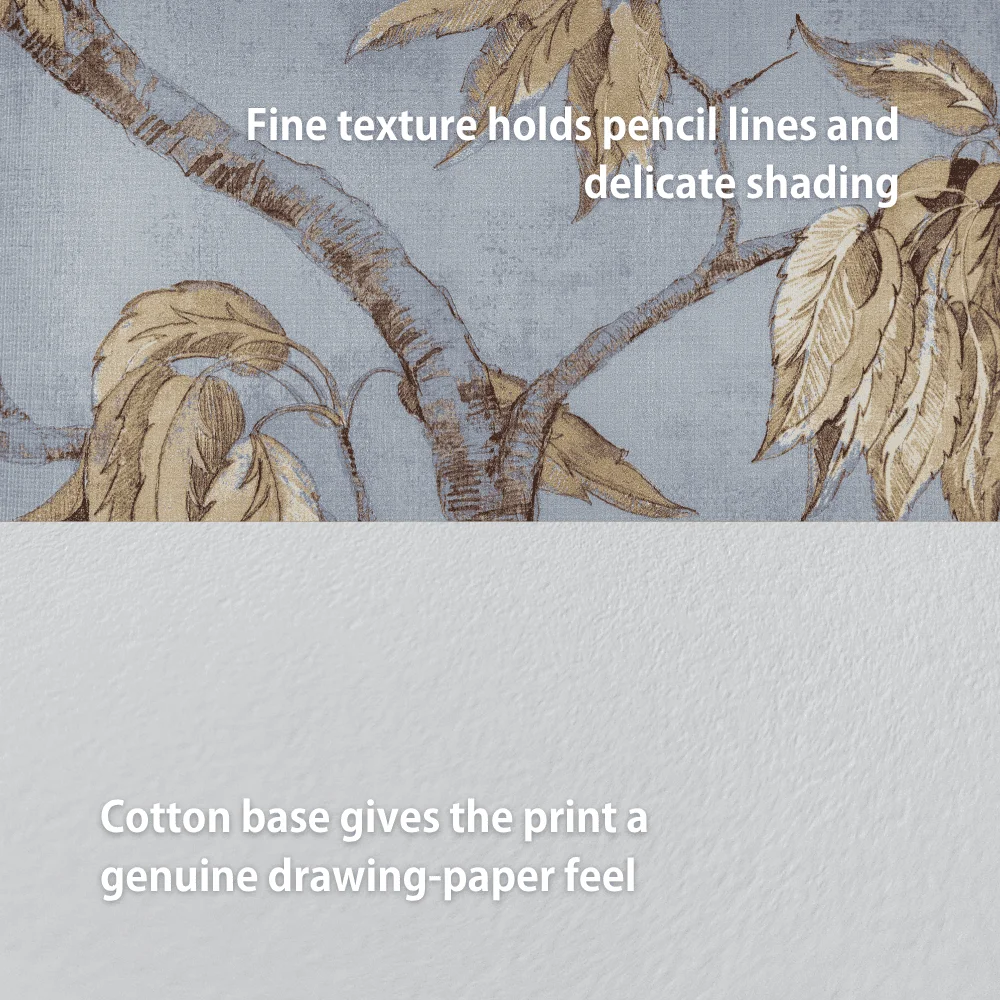
4. Portrait Rag 305, for pencil and detailed work
305gsm, 100% cotton rag, lightly textured matt, mid-white. The texture is fine enough to hold pencil lines and delicate shading, but still gives the print a genuine drawing-paper feel. It also handles vibrant, lightly textured paintings well.
305gsm, 100% cotton rag, lightly textured matt, mid-white. The texture is fine enough to hold pencil lines and delicate shading, but still gives the print a genuine drawing-paper feel. It also handles vibrant, lightly textured paintings well.
Drawback: the texture is subtle, so it won’t bring out heavy brushwork the way a stronger weave does.
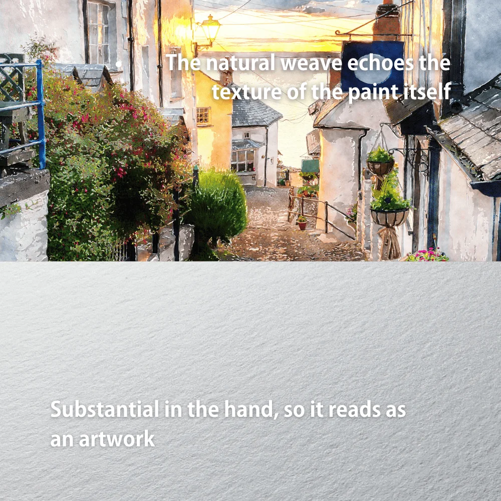
5. Museum Heritage 310, for textured brushwork
310gsm, a cotton and alpha cellulose blend, with a naturally textured matt surface, mid-white. The pronounced weave gives oil and acrylic reproductions a physical, painterly quality, and at 0.50mm thick it feels substantial in the hand.
Drawback: the texture competes with fine detail, so it’s the wrong choice for drawings or tightly detailed digital work. The thickness also needs a printer with a rear or straight feed path.
6. Watercolour Rag 310, for watercolours and archival editions
310gsm, 100% cotton rag, with a watercolour-style textured surface and a natural warm white base. It’s the only paper of the six that is OBA-free, making it the choice for limited editions and work sold on its archival credentials. For watercolour reproductions it’s the closest match to the original sheet.
Drawback: the warm base shifts cool colours and bright whites slightly warmer, and the strong texture doesn’t suit crisp digital or line work.
How to Choose the Right Paper for your Work
Reading about paper can only take you so far. The most reliable way to decide is to print the same piece on several papers and compare them side by side.
The Artist Essentials Test Pack is built for exactly this. It contains two sheets of each of our most popular papers for artists, so you can test your own work across different weights, textures and tones before committing to a full box.
To get a fair comparison:
- Pick a piece that shows your style at its most typical. If you work in several styles, print one of each.
- Use the correct ICC profile for each paper. Every PermaJet paper has a free ICC profile. Without it, you’re comparing guesswork rather than paper.
- Let Photoshop or your editing software manage colour, and switch colour management off in the printer settings.
- Judge the prints in the light they’ll be seen in. Daylight or a neutral lamp, not a warm household bulb.
- Think about the buyer as well as the look. An open edition sold at markets and a numbered limited edition have different needs, and the right paper for one isn’t always right for the other.
Most artists find one paper that suits their core work and a second for special editions. Testing is how you find yours.
In Summary
The best paper for art prints is the one that makes your reproduction feel closest to the original. Start with how the artwork was made: textured papers for painted work, smooth or lightly textured papers for drawings, bright and smooth for digital art. Then think about weight, whiteness and who’s buying.
As a shortcut: Watercolour Rag 310 for watercolours and archival editions, Museum Heritage 310 for oils and acrylics, Portrait Rag 305 for pencil and detailed work, Matt Plus 240 for digital art in volume, Photo Art Silk 290 for rich premium pieces, and Portfolio Rag 220 for soft, subtle work.
Then test. A few sheets of each paper with your own artwork on them will tell you more than any guide, and it means every print you sell is on the paper that does your work justice. If you’re setting up to print at home, our Guide to Home Printing for Artists covers printers and colour management too.
The Knowledge Vol 3:
Paper is one part of a bigger process. Our new ebook, The Knowledge Vol 3: The Complete Guide to Art Prints, covers the rest of it.
Written for artists reproducing and selling their own work, it takes you from capturing the original through to the finished, framed print. Scanning and photographing artwork, getting colour accurate, choosing a printer, print settings step by step, and how to finish, sign and store your editions.
It’s free, and it’s the guide we wish we’d had when we started printing.
FAQ’s
It depends on the artwork. For most reproductions, a heavyweight, acid-free matt paper works best, because it looks like traditional art paper and doesn’t reflect light. Textured cotton rag suits paintings, smoother papers suit drawings and digital art. Testing a few papers with your own work is the surest way to decide.
Around 250gsm and above feels substantial and frames well. Most fine art papers sit between 240gsm and 310gsm. Lighter papers around 220gsm suit smaller prints and cards, while 300gsm and above gives the weight buyers expect from a premium or limited edition piece.
Matt, in most cases. A matt surface removes glare, looks closer to the original artwork, and handles soft tonal transitions well. Gloss and lustre papers give more colour punch and deeper blacks, so they can suit bold digital or graphic work, but they reflect light once framed or hung.
For work you’re selling as fine art, usually yes. Cotton rag has a soft, natural feel, excellent longevity and a nuanced tonal range, and buyers notice the difference in the hand. For open editions in high volume, a good alpha cellulose paper gives a similar look at a lower cost.
A cotton rag with a watercolour-style texture and a warm, natural white base. It brings back the grain of the original sheet and keeps pale washes soft. Watercolour Rag 310 is our choice, and as an OBA-free paper it also suits archival limited editions.
For prints you intend to sell, you need a pigment ink printer. Dye inks fade much faster, particularly in daylight. Our guide to dye vs pigment ink explains the difference.