


Turning great landscapes into great prints
You’ve captured the landscape. You’ve edited it. Now comes the part that can make or break the final image: choosing the right paper.
The finish, texture and weight of your paper can completely change how your landscape looks and feels in print. So, whether you’re printing a vibrant sunset, a moody woodland or a misty mountain scene, choosing the right surface matters.
A landscape print carries more information than almost any other kind of photograph – wide tonal range, subtle colour shifts and fine detail running from foreground rock to distant hillside. The paper you print it on decides how much of that survives the journey from screen to wall.
Finish, weight and texture all change what the viewer sees. The same file printed on a gloss photo paper and a cotton rag can look like two completely different photographs, and neither is wrong. Choosing the best photo paper for landscape prints is really about matching the surface to the mood of the scene.
In this guide, we’ll explore how each variable affects your print, which PermaJet papers suit different types of landscape photography, and how to test before you commit to a box.
Why paper choice matters for landscape printing
The surface of a paper controls how light leaves the print. A gloss coating reflects light in a single direction, so colours read as saturated and blacks stay deep. A matt surface scatters light, which lifts the shadows slightly and softens the maximum black. That difference shows up most clearly in the darkest 10% of an image, which is exactly where landscape work tends to live: shadowed valleys, storm cloud, backlit trees.
Sharpness follows the same rule. A smooth surface holds fine detail cleanly, so distant textures like heather, shingle or brickwork stay crisp. A heavily textured rag introduces its own surface pattern, and at normal viewing distance that reads as softness.
Colour gamut varies too. Gloss and lustre papers hold a wider gamut than matt fine art papers, so intense colour, a sunset or autumn woodland, has more room to breathe.
None of this makes one paper better than another. It makes each one suited to a different kind of scene.
Gloss vs Lustre vs Matt: Choosing the right finish for landscapes prints
Gloss gives the widest colour gamut and the deepest blacks of any inkjet surface. Detail looks sharpest here, and saturated scenes hold their intensity. The cost is reflection. A gloss print under a window or a downlight throws glare straight back at the viewer, and it shows fingerprints. Behind glass, gloss on gloss can double the problem.
Oyster, lustre and satin sit between the two. You keep most of the gloss gamut and most of the black density, but the fine stipple in the surface breaks up reflections, so the print stays readable in ordinary room lighting. Blacks measure slightly lower than gloss and the surface texture is visible up close, which some photographers like and some do not. This is the safe choice when you do not know where the print will hang.
Matt and textured Fine Art papers scatter light completely, so there is no glare from any angle. Shadows open up and the whole image reads softer and more tactile. In exchange you lose maximum black density and some colour saturation, and fine detail sits behind the paper texture. Prints on these papers reward close viewing and neutral lighting.
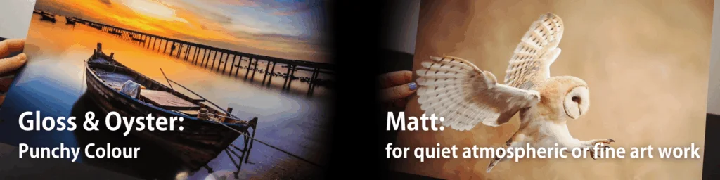
As a rule of thumb: gloss and oyster for punchy, colour-led landscapes, matt and rag for quiet, atmospheric or fine art work.
Matching a paper surface to your style of landscape photography
Vibrant, high-contrast scenes. Sunsets, autumn woodland, blue hour coastlines and anything driven by colour need gamut. Gloss and oyster surfaces hold the reds and oranges that matt papers flatten, and they keep the tonal separation in a bright sky. If the print’s impact depends on colour, start here.
Soft, muted and misty scenes. Fog on a hillside, winter fields, long-exposure water. These images live in a narrow band of close tones, and a smooth matt or lightly textured fine art paper handles that better than gloss. The scattered light softens tonal transitions instead of exaggerating them, and the print feels closer to a painting than a photograph.
Detail-heavy scenes. Rock faces, woodland interiors, anything where the eye wants to travel into the frame. A smooth surface, whether gloss, oyster or a smooth fine art paper, keeps that detail intact. Avoid heavy textures, which compete with the detail already in the image.
Black-and-white landscapes. Baryta and fibre-based papers were designed for this. The baryta coating gives you deep, dense blacks and a long, smooth tonal ramp through the mid greys, which is precisely what a monochrome landscape needs. A textured cotton rag will look softer and more traditional, but you give up some of that black density. If the image relies on strong contrast, choose baryta.
Brand Ambassador: Adele Warner Tate
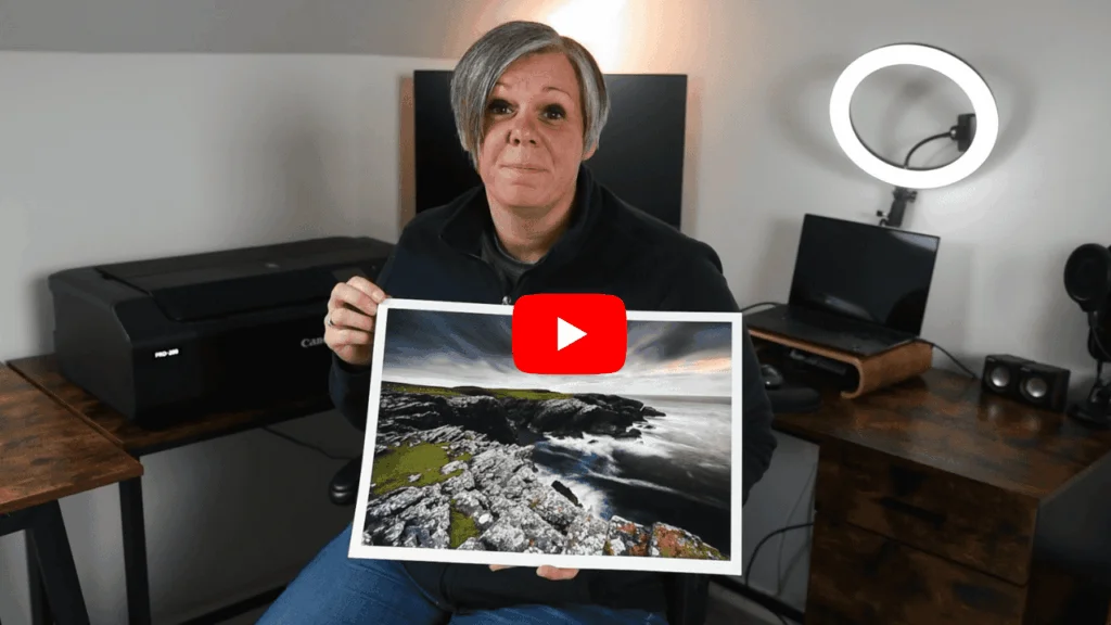
PermaJet ambassador Adele Warner-Tate captures stunning long-exposure coastal seascapes. She then uses Titanium Gloss 300 paper, which expertly emphasises water textures, ambient light, and vibrant, moody sky colours.
“It looks beautiful on PermaJet’s Titanium Gloss. It’s a beautiful paper and one that I’ll be using again and again for our seascape photography”
Paper Weight (GSM) and Texture
Most landscape work gets printed somewhere between 240gsm and 310gsm. Below that, paper feels flimsy in the hand and is more likely to curl or cockle as ink dries. Above it, you gain rigidity and presence but need to check your printer handles the thickness, usually via a rear or single-sheet feed path.
Weight does not affect image quality directly. It affects how the print behaves and how it feels. A 310gsm cotton rag has a stiffness and a soft edge that reads as an object in its own right, which matters if the print is going into a portfolio or being sold unframed. A 271gsm photo paper is easier to handle, easier to feed and easier to post, and behind glass the difference in weight is invisible.
Texture is the bigger decision. Smooth surfaces hold micro-detail and give a clean, neutral read of the image. Textured surfaces, from a light stipple to a heavy watercolour tooth, add a physical character to the print that lifts simple compositions and can bury complex ones. A minimal seascape gains something from texture. A woodland interior at 60 megapixels rarely does.
Print size matters here too. Texture that looks pronounced at A4 recedes at A2, because you view the larger print from further back. If you are working big, you can be bolder with surface.
Fine Art vs Photo Papers for Landscape Printing

The split is in the base. Photo papers like PermaJet’s Photo Lustre 310 use a microporous resin coating over the paper core. The coating sits on the surface, dries almost instantly, resists water and handling, and holds a wide colour gamut. That makes them practical: easy to feed, easy to post, hard to damage.
Fine art papers print onto the paper itself, either cotton, alpha cellulose, or a blend of the two. PermaJet’s Museum Heritage 310 is 25% cotton and 75% alpha cellulose. Ink sinks slightly into the fibre rather than sitting on a coating, which is what gives fine art prints their soft edge and depth, and why they take longer to dry and need more careful handling.
Baryta papers sit between the two traditions. PermaJet’s FB Distinction 320 and PermaJet’s FB Gold Silk 315 use a fibre base with a barium sulphate coating, the same principle as darkroom fibre paper. You get the deep blacks and sheen of a photo paper on a fine art body.
On longevity, the things that matter most are an acid-free base and pigment inks rather than dye. Both give you a print that will hold up for decades in normal display conditions. It’s also worth knowing about optical brightening agents, or OBAs: whiteners added to make a paper look brighter, which slowly lose their effect over many years, so a print can drift very slightly warmer over a long life. Most modern inkjet papers use them. For a print hanging in a normal room it isn’t something to worry about, but it’s the kind of detail worth understanding if you’re selling work or printing for permanence.
The Best Photo Paper for Landscape Prints: Four Recommended Options
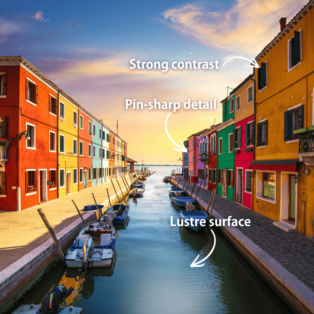
1. PermaJet’s Photo Lustre 310, for vibrant colour landscapes
310gsm, resin-coated, bright white lustre surface, CIE whiteness 112. The brightest base of the four, and the widest colour gamut, so sunsets, autumn colour and blue hour scenes hold their intensity. The lustre surface breaks up reflections, so it hangs well in ordinary room lighting. It dries instantly and handles easily, which makes it the sensible choice for prints going out to clients or into the post.
Drawback: the resin coating gives a slightly plastic feel next to the fibre-based papers, and the bright base is not the right starting point for a quiet, muted image.
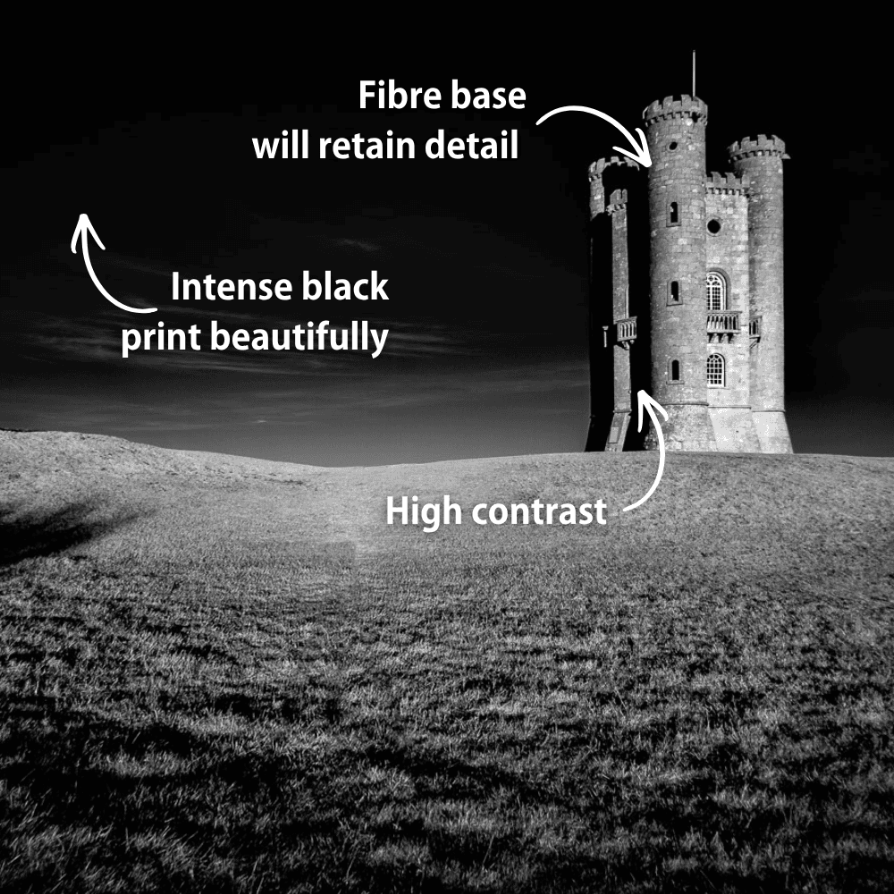
2. PermaJet’s FB Distinction 320, for high-contrast black-and-white
320gsm baryta on an alpha cellulose base, bright white with a delicate gloss sheen. This is the maximum-impact option: exceptional Dmax, deep shadows that keep their detail, and a long tonal range through the mid greys. If your monochrome landscape lives on strong contrast, storm light, dark water, backlit ridgelines, this is the paper.
Drawback: at 0.35mm it needs a printer with a straight or rear feed path, and the semi-gloss surface still picks up reflections at sharp angles.
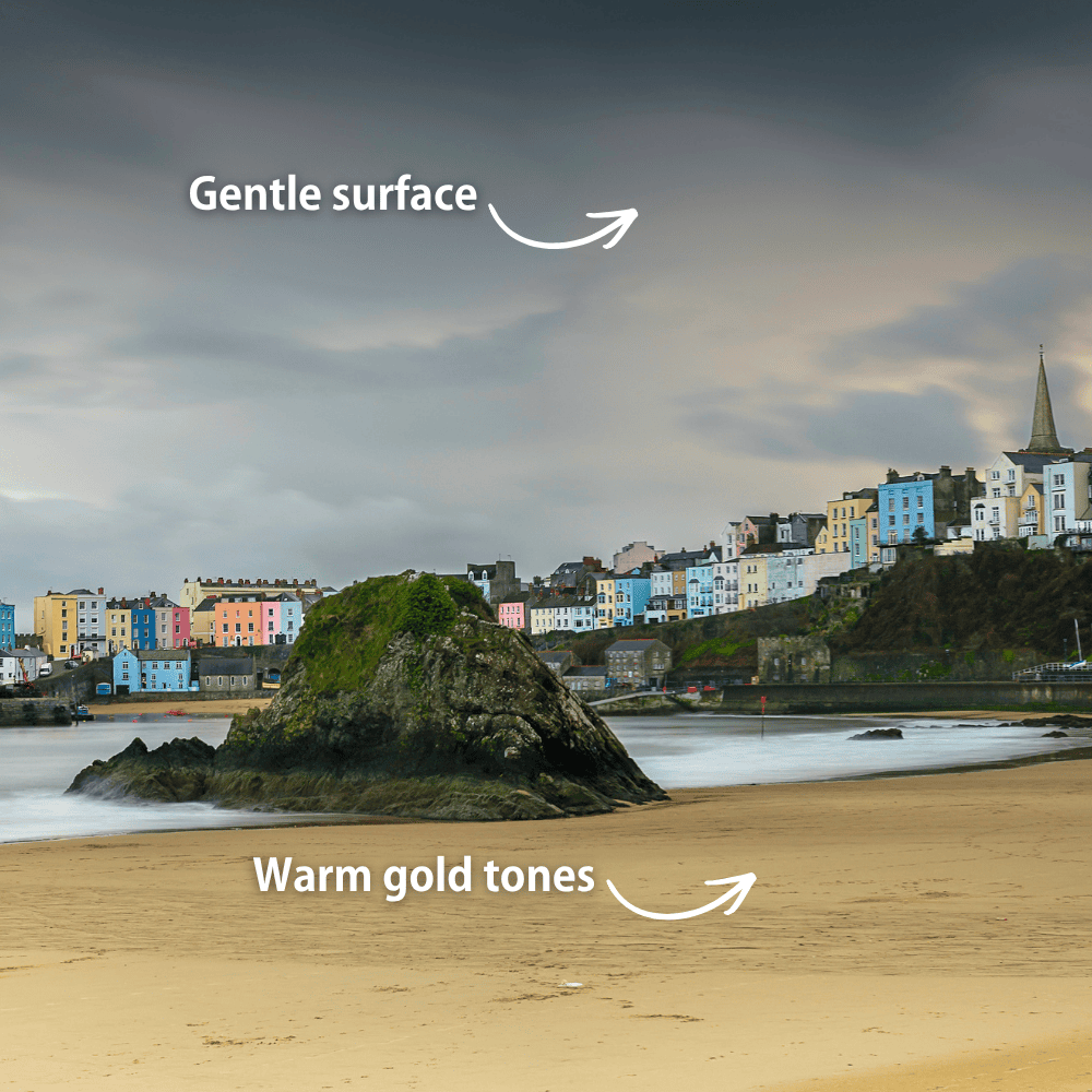
3. PermaJet’s FB Gold Silk 315, for traditional, warmer work
315gsm baryta with a warm white base and a smooth satin surface, CIE whiteness 101. It has the fibre-base depth of Distinction but a gentler surface and a warmer tone, closer to a traditional darkroom print. That warmth suits golden hour, autumn woodland and monochrome work you want to feel classic rather than clinical.
Drawback: the warm base is exactly wrong for cold-toned images. A snow scene or a blue-hour coastline will read warmer than you intended.
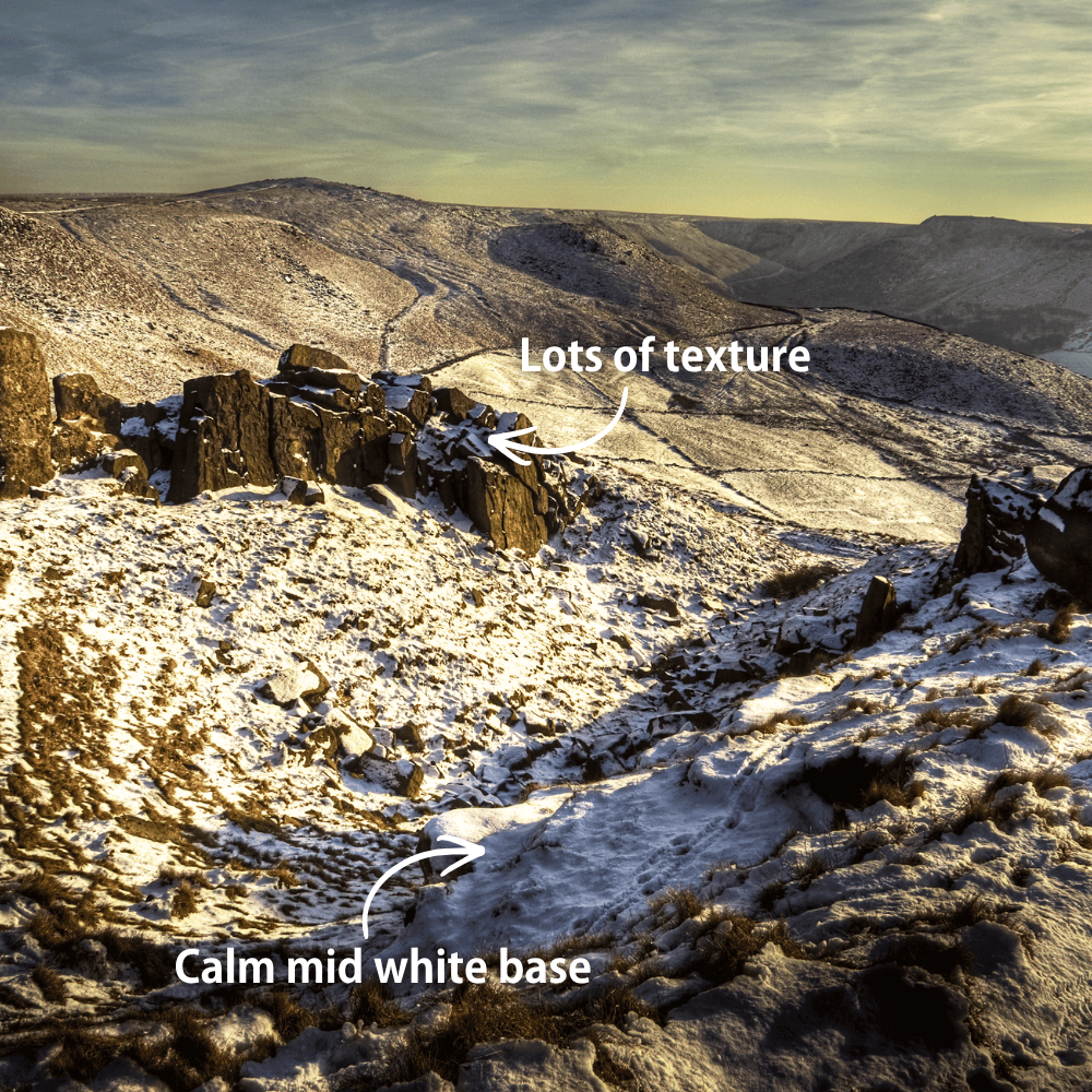
4. PermaJet’s Museum Heritage 310, for fine art texture
310gsm, 25% cotton and 75% alpha cellulose, with a rough textured weave and a matt surface. At 0.50mm it is the thickest of the four and feels like an object in the hand. The texture gives rustic and atmospheric landscapes a physical, painterly quality that no coated paper can match, and the mid-white base at CIE 91 keeps things calm.
Drawback: matt papers give up maximum black density and colour saturation, and the texture competes with fine detail. Not the paper for a high-resolution woodland interior.
How to choose and test your paper
Three things to get right before you judge the results:
Use the correct ICC profile. Every PermaJet paper has a free downloadable profile for common printers. Without it you’re judging the profile, not the paper, and that’s the single most common reason a print comes out looking nothing like the screen.
Check your black ink setting. PermaJet’s Photo Lustre 310, PermaJet’s FB Distinction 320 and PermaJet’s and FB Gold Silk 315 all use Photo Black. PermaJet’s Museum Heritage 310 uses Matte Black. Printing a matt fine art paper with Photo Black loaded will give you weak, muddy blacks and send you to the wrong conclusion about the paper.
Soft proof first. Soft proofing in Lightroom or Photoshop against the paper’s profile shows you which colours fall outside that paper’s gamut before you commit a sheet. It won’t be exact, but it will warn you when a saturated sunset is about to flatten on a matt paper.
Then judge the print in daylight, or under a consistent daylight-balanced lamp. Warm domestic bulbs will make every paper look warmer than it is.
PermaJet Test Packs contain several sheets from each range so you can try our papers at an affordable price. The FB Baryta Test Pack puts PermaJet’s FB Distinction 320 and PermaJet’s FB Gold Silk 315 next to each other in A4, which is the fastest way to settle the neutral-versus-warm question for your own work. The Heritage Range Discovery Pack does the same for the fine art papers. Pick one image with deep shadows and one with subtle colour, print both on everything in the pack, and the decision usually makes itself.

FAQs
In Summary
There is no single best paper for landscape photography, only the right paper for a given image. Finish decides how much colour and contrast survive and how the print behaves under room lighting. Weight and texture decide how it feels and how much fine detail reaches the viewer. Match those to the mood of the scene and the paper stops being a compromise.
As a shortcut: PermaJet’s Photo Lustre 310 for vibrant colour, PermaJet’s FB Distinction 320 for high-contrast monochrome, PermaJet’s FB Gold Silk 315 for warmer and more traditional work, PermaJet’s Museum Heritage 310 for texture and atmosphere.
Then test. Print one shadow-heavy image and one subtle-colour image across a sample pack, use the correct ICC profile and black ink setting, and judge them in daylight. An afternoon spent doing that will tell you more than any guide, and it means the next box of paper you buy is the right one.