

The Importance of Lighting Your Artwork
Lighting plays a crucial role in how art prints and photographs are experienced. The right lighting enhances colour, detail, and texture, while poor lighting can flatten an image or even cause long-term damage.
Whether you’re displaying prints at home, in a studio, or as part of a gallery wall, understanding how to light your artwork properly makes a noticeable difference.
This guide covers the key principles of lighting for art prints and photographs, helping you create a setup that looks professional and protects your work over time.

Embrace Soft, Indirect Lighting
One of the most common mistakes when lighting art prints and photographs is using harsh, direct light. Strong lighting can create glare, wash out colours, and reduce the visible detail in your work. This is especially noticeable with photographic prints and fine art papers, where subtle tones and textures are important.
Instead, aim for soft, indirect lighting that spreads evenly across the surface of the print. This helps maintain colour accuracy and allows details to remain clear without harsh reflections.
To achieve this:
- Use diffused lighting rather than exposed bulbs
- Position lights so they bounce off walls or ceilings
- Choose lamps or fittings with shades or covers to soften intensity
This approach creates a more natural, gallery-style look and ensures your artwork remains the focus. It also reduces the risk of hotspots or uneven lighting across the print surface.
Choose the Right Colour Temperature
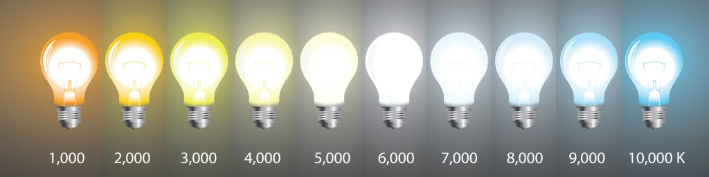
Lighting is not just about brightness. Colour temperature has a direct impact on how your art prints and photographs appear. The wrong lighting can shift colours, making prints look warmer, cooler, or less accurate than intended.
Colour temperature is measured in Kelvin (K) and typically falls into three ranges:
- Warm white (2700K–3000K) – Creates a softer, ambient feel but can add a yellow tone that alters colours
- Neutral white (3500K–4100K) – More balanced and suitable for general display
- Daylight (5000K–6500K) – Crisp and clean, offering higher colour accuracy
For most art prints and photographic work, a range of 4000K–5000K provides the best balance. It keeps colours looking natural without feeling too warm or too clinical.
This is particularly important for inkjet prints, where colour accuracy and tonal detail are key. Using the right colour temperature ensures your prints appear closer to how they were intended when created.
Prioritise High Colour Accuracy (CRI)
If you want your art prints and photographs to look as intended, Colour Rendering Index (CRI) is one of the most important factors to consider. CRI measures how accurately a light source displays colours compared to natural light.
Lower-quality lighting can make colours appear dull, flat, or slightly off, even if your print itself is perfectly produced. This is especially noticeable in photography and fine art prints where subtle tonal shifts and colour balance matter.
When choosing lighting:
- Look for bulbs with a CRI of 90 or higher
- Avoid low-CRI lighting, which can distort colours and reduce depth
- Combine high CRI with the correct colour temperature for the best results
High-CRI lighting ensures that the effort put into creating and printing your work is actually visible. It allows colours to remain accurate and consistent, whether you’re viewing a detailed photograph or a fine art print.
Manage Natural Light Carefully
Natural light can make a space feel ideal for viewing art prints and photographs, but it needs to be controlled. While daylight often shows colour accurately, it also changes throughout the day and can cause long-term damage if not managed properly.
Direct sunlight is the main issue. It can wash out colours, create glare, and over time cause fading in prints, especially with photographic and inkjet materials.
To use natural light effectively:
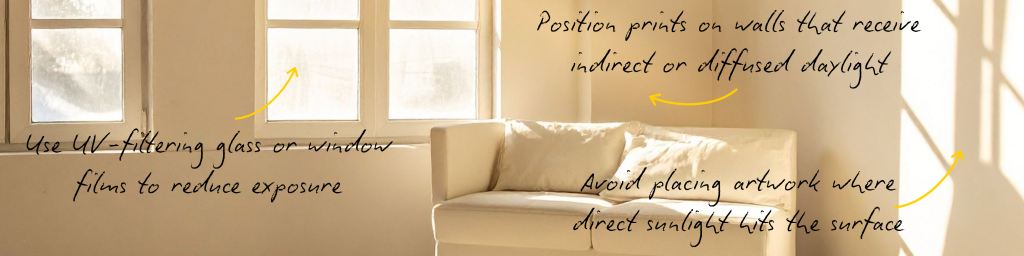
- Avoid placing artwork where direct sunlight hits the surface
- Use UV-filtering glass or window films to reduce exposure
- Position prints on walls that receive indirect or diffused daylight
Even high-quality prints can degrade over time when exposed to strong UV light. Controlling natural light helps preserve both colour accuracy and longevity, keeping your work looking consistent for longer.
Reduce Glare and Reflections
Glare is one of the quickest ways to ruin the viewing experience of art prints and photographs. It can flatten detail, distort colours, and make it difficult to properly appreciate the work, especially when prints are framed behind glass.
This usually happens when lighting is positioned incorrectly or too close to the viewing angle. Even high-quality prints can look poor if reflections dominate the surface.
To reduce glare:
- Position lights at around a 30-degree angle to the artwork
- Avoid placing lights directly opposite the viewing position
- Use matte or anti-reflective glass for framed pieces where possible
- Adjust room lighting so it doesn’t directly hit the print surface
Small changes in placement can make a significant difference. The goal is to illuminate the artwork without lighting the glass itself.
Use Accent Lighting for Impact
Accent lighting is what brings focus and depth to art prints and photographs. Instead of lighting the whole room evenly, it highlights specific pieces and helps guide the viewer’s attention.
Used correctly, it can make prints feel more intentional and professionally displayed rather than just placed on a wall.
To use accent lighting effectively:
- Use track lighting or adjustable spotlights to direct light precisely
- Consider wall-mounted picture lights for framed pieces
- Make sure accent lighting is slightly brighter than the surrounding ambient light so the artwork stands out
A useful rule is to keep accent lighting roughly two to three times brighter than the general room light, but still soft enough to avoid harsh contrast or glare.
This approach adds depth, separates the artwork from the background, and creates a more curated, gallery-like feel.

Protect Your Artwork from Heat and UV
Lighting is not just about how artwork looks, it also affects how long it lasts. Heat and ultraviolet (UV) exposure are two of the main factors that can cause prints and photographs to degrade over time.
Inkjet prints, in particular, can be sensitive to prolonged exposure, with colours slowly fading or shifting if not properly protected.
To reduce risk:
- Choose LED lighting, which produces very little heat and minimal UV output
- Avoid halogen or incandescent bulbs, which generate more heat
- Keep light sources at a safe distance from framed or unprotected prints
- Limit prolonged direct exposure to strong light sources
Good lighting should enhance the artwork without accelerating wear. Protecting prints from heat and UV helps preserve colour accuracy and detail for the long term.
Match Lighting to the Room
The best lighting setup for art prints and photographs always depends on the space they are in. Lighting should support both the artwork and the atmosphere of the room, rather than overpowering either.
Different environments call for different approaches:
- Living rooms: Warm to neutral lighting creates a relaxed, comfortable feel while still showing prints clearly
- Studios or workspaces: Cooler, more neutral lighting helps maintain colour accuracy and focus
- Hallways or transitional spaces: Softer, directional lighting works well for subtle emphasis without overwhelming the space
The key is balance. Your artwork should feel like part of the environment, not something artificially spotlighted or disconnected from the room.
When lighting and space work together, prints feel more natural, cohesive, and intentional.
For checking your prints more closely, a dedicated daylight viewing lamp helps reveal fine detail, accurate colour, and subtle tonal differences that standard room lighting can miss
Final Thoughts
Good lighting transforms how art prints and photographs are experienced. It can enhance colour, reveal detail, and create depth, but it can also distort or diminish work if not considered properly.
By combining soft lighting, correct colour temperature, high CRI, and careful placement, you create an environment where prints look consistent and intentional. Just as importantly, the right lighting helps protect your work so it lasts longer without fading or damage.
Whether you are displaying a single photograph or building a full gallery wall, lighting is what brings everything together.
Quick Checklist
- Use soft, indirect lighting
- Aim for 4000K–5000K colour temperature
- Choose bulbs with CRI 90+
- Avoid direct sunlight on prints
- Reduce glare with correct angles and positioning
- Use LED lighting for safety and longevity